Tailwind Dark Mode Guide
July 1, 2025
 Ashish Gogula
July 1, 2025
Ashish Gogula
Follow Tailwind’s official installation guide (opens in new tab).
If you're using Vite + React, install:
npm install tailwindcss @tailwindcss/viteCreate or update your vite.config.js:
import { defineConfig } from 'vite';
import tailwindcss from '@tailwindcss/vite';

export default defineConfig({
  plugins: [
    tailwindcss(),
  ],
});
📌 This may vary depending on your framework (e.g., Next.js, Astro, etc.)
In your index.css or main.css:
@import "tailwindcss";Make sure this CSS is loaded in your main file (main.jsx or main.tsx).
By default, Tailwind applies dark mode using class. Tailwind v4+ allows advanced variants via CSS:
@variant dark (&:is(.dark *));@variant dark (&:is(.dark *)) do?This custom variant targets any element inside .dark class, using CSS :is() pseudo-class.
It enables dark styles globally whenever your <html> has class="dark".
<html class="dark">
  <body>
    <div class="bg-white dark:bg-black text-black dark:text-white">
      Hello in Dark Mode!
    </div>
  </body>
</html>useTheme HookInside your src/hooks/useTheme.jsx:
import { useState, useEffect, useCallback } from 'react';

export const useTheme = () => {
  const [isDarkMode, setIsDarkMode] = useState(() => {
    const savedTheme = localStorage.getItem('theme');
    if (savedTheme) {
      return savedTheme === 'dark';
    }
    return window.matchMedia('(prefers-color-scheme: dark)').matches;
  });

  const toggleTheme = useCallback(() => {
    setIsDarkMode((prev) => {
      const newMode = !prev;
      const html = document.documentElement;

      if (newMode) {
        html.classList.add('dark');
        localStorage.setItem('theme', 'dark');
      } else {
        html.classList.remove('dark');
        localStorage.setItem('theme', 'light');
      }

      return newMode;
    });
  }, []);

  useEffect(() => {
    const html = document.documentElement;
    if (isDarkMode) {
      html.classList.add('dark');
      localStorage.setItem('theme', 'dark');
    } else {
      html.classList.remove('dark');
      localStorage.setItem('theme', 'light');
    }
  }, [isDarkMode]);

  return {
    theme: isDarkMode ? 'Dark' : 'Light',
    toggleTheme
  };
};
Let's break down how the custom useTheme hook works and why it's built this way
1. Persist Theme Preference
const [isDarkMode, setIsDarkMode] = useState(() => {
  const savedTheme = localStorage.getItem('theme');
  if (savedTheme) {
    return savedTheme === 'dark';
  }
  return window.matchMedia('(prefers-color-scheme: dark)').matches;
});
We’re initializing the theme based on:
localStorage).window.matchMedia).This initialization function is only run once, thanks to lazy initialization in useState.
2. Toggling Between Themes
const toggleTheme = useCallback(() => {
  setIsDarkMode((prev) => {
    const newMode = !prev;
    const html = document.documentElement;

    if (newMode) {
      html.classList.add('dark');
      localStorage.setItem('theme', 'dark');
    } else {
      html.classList.remove('dark');
      localStorage.setItem('theme', 'light');
    }

    return newMode;
  });
}, []);
This function toggles the theme and does three things:
dark class on the <html> tag.localStorage with the new preference.We wrap it in useCallback to avoid unnecessary re-creations on re-render.
3. Syncing DOM with Theme State
useEffect(() => {
  const html = document.documentElement;
  if (isDarkMode) {
    html.classList.add('dark');
    localStorage.setItem('theme', 'dark');
  } else {
    html.classList.remove('dark');
    localStorage.setItem('theme', 'light');
  }
}, [isDarkMode]);
This useEffect runs every time the theme (isDarkMode) changes.It ensures the class on <html> and localStorage are always in sync with the current theme.
4. What the Hook Returns
return {
  theme: isDarkMode ? 'Dark' : 'Light',
  toggleTheme
};
You get two things:
theme: a readable value ('Dark' or 'Light') for UI use.toggleTheme: a function to switch between modes (can be used in a button or toggle).<html> Tag for ThemeMost Tailwind CSS themes apply styles based on the dark class being present on the <html> or <body> tag. Using document.documentElement ensures global control over the theme from the root.
Here’s how to use the ThemeToggleButton inside your layout or any other page:
import { Moon, Sun } from 'lucide-react';
import { useTheme } from '../../hooks/useTheme';

const ToggleSwitch = () => {
  const { theme, toggleTheme } = useTheme();

  return (
    <div className="min-h-screen bg-white dark:bg-slate-900 text-black dark:text-white transition-colors duration-300 flex items-center justify-center px-4">
      <div className="max-w-md w-full space-y-6 text-center">
        <button
          onClick={toggleTheme}
          className="mx-auto flex cursor-pointer items-center gap-2 px-4 py-2 rounded-xl bg-gray-100 dark:bg-gray-800 hover:bg-gray-200 dark:hover:bg-gray-700 text-gray-900 dark:text-gray-100 transition-colors duration-200"
        >
          {theme === 'Dark' ? <Sun size={18} /> : <Moon size={18} />}
          <span>Switch to {theme === 'Light' ? 'Dark' : 'Light'} Mode</span>
        </button>

        <div className="rounded-xl p-6 bg-gray-50 dark:bg-gray-800 border border-gray-200 dark:border-gray-700">
          <h1 className="text-2xl font-semibold mb-2">Tailwind Dark Mode Demo</h1>
          <p className="text-gray-600 dark:text-gray-300">Current Theme: <strong>{theme}</strong></p>
        </div>
      </div>
    </div>
  );
};

export default ToggleSwitch;
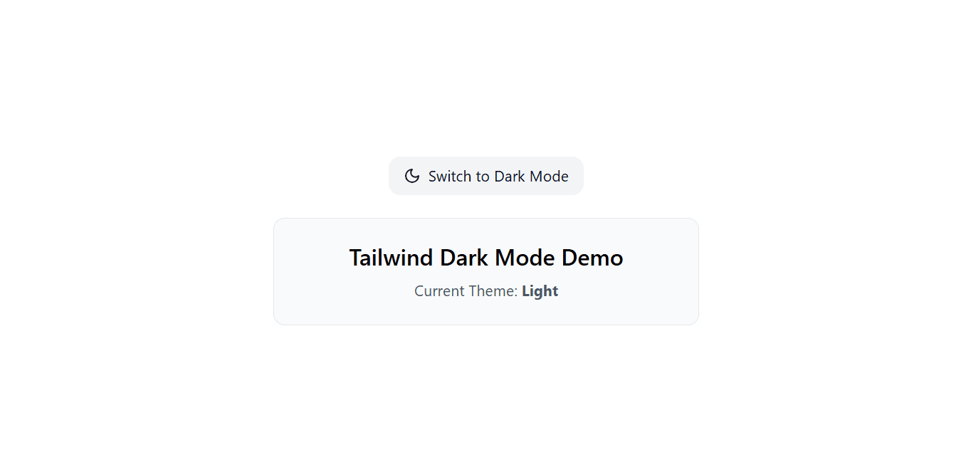
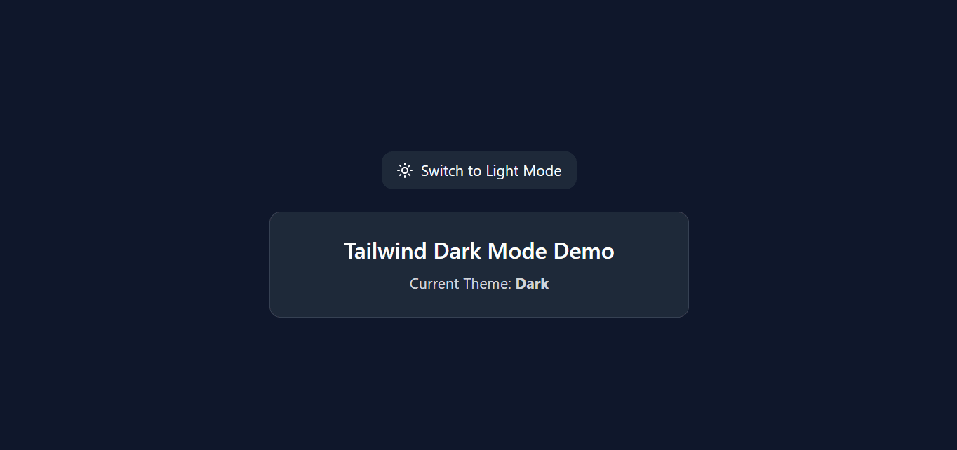
💡 Tip: You can place the toggle button inside your navbar so users can switch themes from anywhere in the app.
Your app now supports system-based theme, manual toggle, and Tailwind dark variants — all using Tailwind v4+, Vite, and React!